A responsive site is a site that will automatically change its content size to fit within your screen size. For example, when you view Sephora on a desktop versus on a mobile phone the size of content is smaller on a phone and the layout is rearranged to a single column. If the site wasn’t responsive then when you view the site on a phone, content will overflow and the sizing would be too large for readability. This is why responsive sites are important, so that contents will automatically resize to fit the screen size it’s being viewed on.
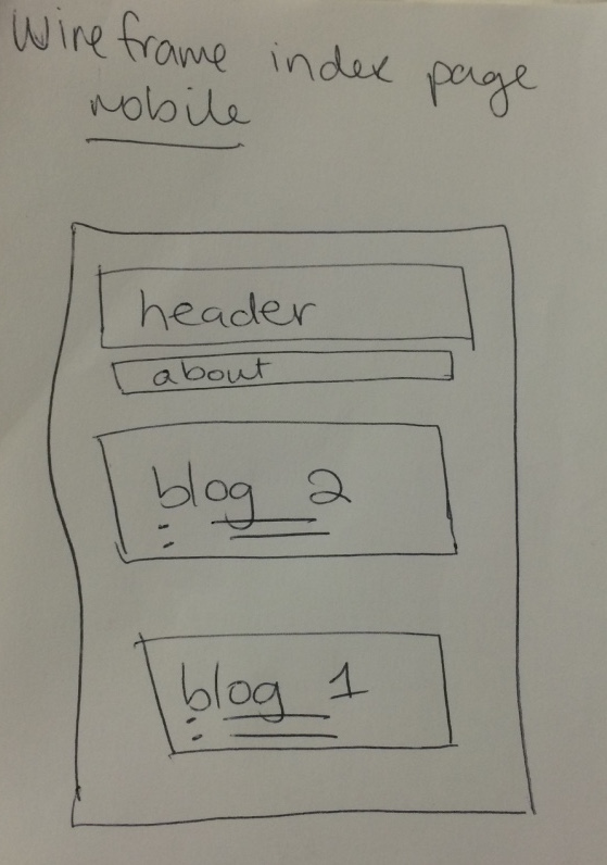
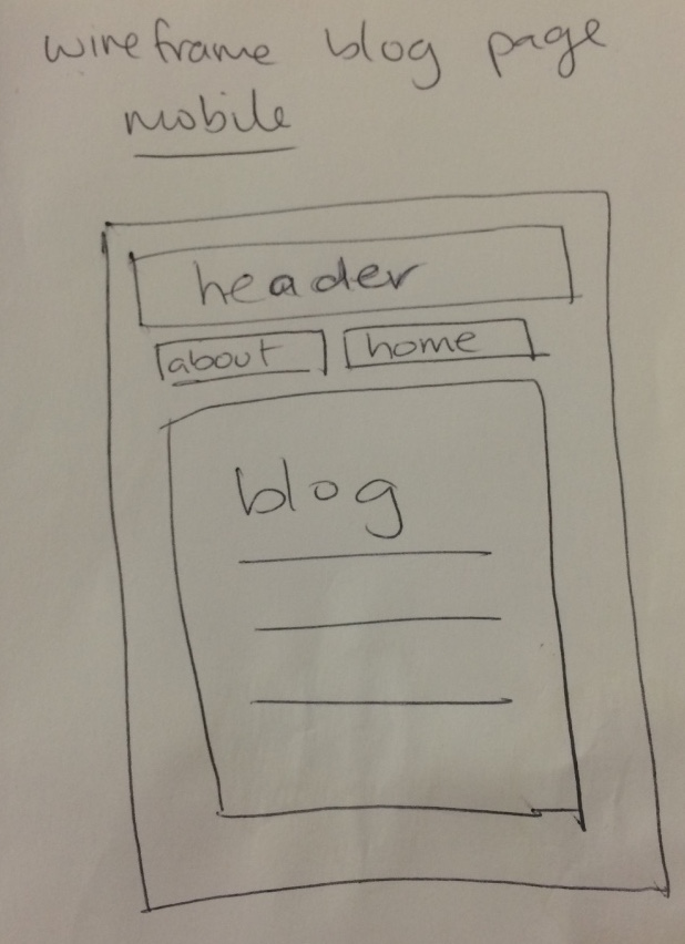
This concept refers to going from a small screen design to a big screen design. With mobile devices becoming more technological and having better functions, particularly in viewing websites, there came a need to design webpages that were more suited for viewing on the phone. The idea of mobile first design refers to thinking, designing and creating designs of webpages to be viewed on a small mobile device, and then altering the design to suit a larger screen size. Because a webpage viewed on a phone is much smaller than on a tablet or desktop, it would be easier to add extra features to websites on a desktop than take away to fit everything on a smaller screen while maintaining functionality.
CSS frameworks are codes that are prewritten that you can use to style your webpages.
Pros: they save time as many of the styles are already prefixed so you don’t have to individually change each attribute to style your webpage.
Cons: if you want to style your content in a way that is different to the framework you will have to overwrite the code in the framework.
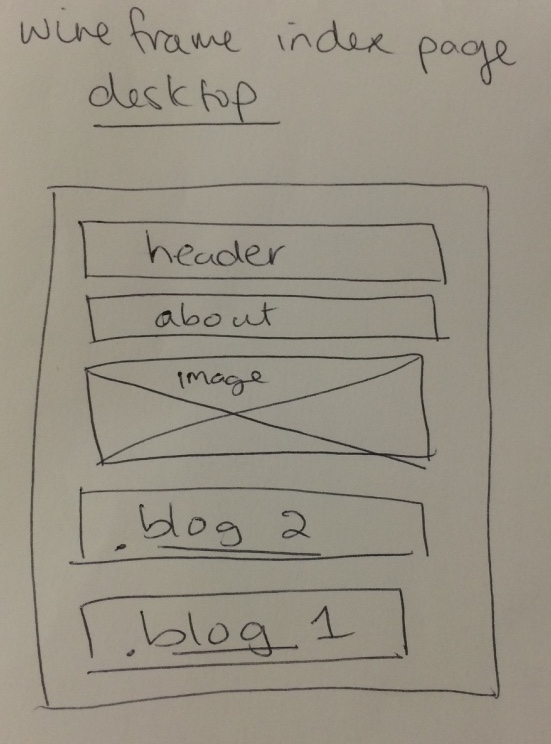
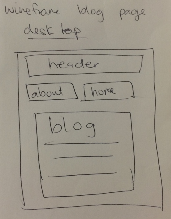
Wireframes are like blueprints of your website before you design it. They show the main locations of where content, headings, images and navigation will be. This helps to give an idea of what the final product will look like and you have a reference to check back to ensure you are going on the right path in creating your webpage without straying from the original design. However if you find that an element isn’t working you can always move it around, you don’t have to follow the wireframe 100% if you find it doesn’t work well live.
Creating columns, the concept took a while for me to understand. The heading took a while to do because it was hard to position it correctly. Tried to find a way to find the header links one colour and the other links throughout the page another colour, but couldn’t figure out how, so for the header changed the background colour from black so that the links could be black. Also it was difficult trying to get the wireframe images be in a row, they kept overlapping each other.